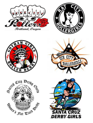
My league is gearing up to have a logo contest soon, so I was looking at themes other skaters have gone with to gather an idea of what we might want. Here are some I picked out that I like. Sorry the image quality is not that great, but you don't need to steal graphics from here anyway.
I find it sort of funny that despite the fact Rat City was involved in a lawsuit with Starbucks regarding their logo, that so many other teams have decided a circle is the standard blueprint for a derby logo. I suppose since Rat City won their lawsuit the rest of the nation decided it was no holds barred on intellectual property infringement. I had to consciously seek out logos that weren't round, and they're all still pretty round. I mean come on people, come up with something more original! If you google "Roller Derby Logos" you will find the majority are circle designs.
This one’s pretty
sweet though, right?
And check out these totally cool men’s derby logos!
Man. Guys like green.
Please share with me some of the designs that you all think are cool, or tell me why you like some of the ones above.


Just my thoughts on the logo...round translates really well to patches without having to pay for custom shaping...so merch costs are managed better - that's why we are round anyway.
ReplyDelete